How we can tell better stories with Data!

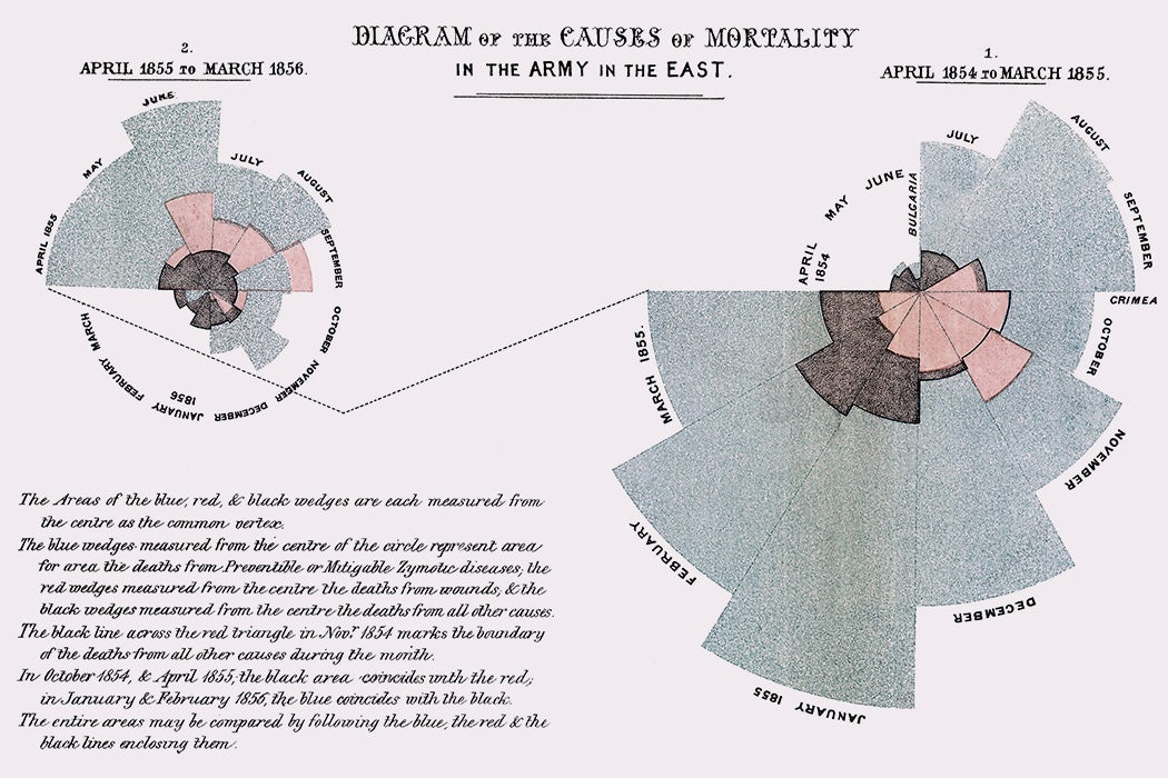
In the summer of 1856, Florence Nightingale angrily sailed home from war. As a nursing administrator of a British Army hospital network, she had witnessed hundreds and thousands of sick soldiers suffer in filthy wards. An entire fighting force had been effectively lost to disease and infection. Nightingale realized that the diseases rampant in those camps were inflicting more deaths than enemy bullets, from there on she took it upon herself to fix this situation, to show how serious the situation was, Nightingale created many visualizations to show the humongous number of soldiers being affected by diseases.
Nightingale's best-known diagram is this colourful depiction of causes of mortality, illustrated by overlapping wedges. Part of the chart's enduring success is attributable to its strange yet interesting form; others at the time presented similar data in conventional line graphs, to little effect. As the middle story element of her visual argument, it elevated two comparisons. The first shows that deaths from preventable diseases (blue) greatly outnumbered hospital deaths from wounds (red). The second comparison, repeated from the first diagram, is between the first year (right) and the second year (left) of the war. It shows that mortality declined significantly between the two years, which are linked by a jagged line, and encourages readers to wonder what occurred to make such a difference.

Why use storytelling for presenting data?
Storytelling with data is the art of using data, facts, and statistics to communicate a compelling message that informs, educates, and inspires. In today’s data-driven world, storytelling with data has become an essential tool for organizations, businesses, and individuals looking to communicate their ideas and insights effectively.
Start with the why!
The first step in storytelling with data is to identify the story that you want to tell. This could be a message about a problem you want to solve, an opportunity you want to highlight, or a trend you want to explain. Once you have identified your story, you need to gather and analyze the data that will support it. This may involve collecting data from a variety of sources, such as surveys, studies, and databases.
Analyze...
Once you have the data, it’s time to start visualizing it. Data visualization is a powerful tool that can help to bring your story to life. There are many different types of data visualization, including bar charts, line graphs, scatter plots, and heat maps. The type of visualization you choose will depend on the type of data you have, the story you want to tell, and the audience you want to reach.
It’s important to remember that storytelling with data is not just about presenting facts and figures. It’s also about putting those facts and figures into context, making them relevant and accessible to your audience. To do this, you need to craft a narrative that guides your audience through the data, helping them to understand the story you are trying to tell.
and Visualize!
One effective way to do this is by using data visualization to highlight key trends and patterns. For example, you could use a bar chart to show the growth of a particular industry over time, or a line graph to show how a particular metric has changed over the years. Another way to put data into context is to use anecdotes or examples to illustrate your points. This could involve telling a story about a person who has been affected by the issue you are discussing, or highlighting a case study that demonstrates the impact of a particular solution.
Keep evolving!
Finally, it’s important to remember that storytelling with data is not a one-time event. You should continue to update your data and refine your story as new information becomes available. This could involve adding new data points, revising your visualizations, or tweaking your narrative to reflect new insights or trends.
In conclusion, storytelling with data is a powerful tool for communicating complex ideas and insights. Whether you are trying to educate your audience about a particular issue, highlight an opportunity, or explain a trend, storytelling with data can help you to communicate your message effectively and make a lasting impact. To be successful, it’s important to identify your story, gather and analyze your data, visualize your data, craft a narrative, and continue to refine your story as new information becomes available.


